Do you want to offer a mobile version of your Joomla! website ?
Don't search anymore, this tutorial is for you ! You will learn step by step how to make your design compatible with almost mobile peripherics (iPhone, iPad, tablettes, Android, etc ...). A concrete example with the template included in the package, you will see how to play with the Responsive Design in Joomla!
First you will see a shot description of the techniques and then you will play with the code of a Joomla template to add it your own styles. This way you can adapt it for each resolution. Each step is explained with a detailed example and some CSS code to know how it works.
This package is composed of :
- A tutoriel PDF of 50 pages with examples and illustrations
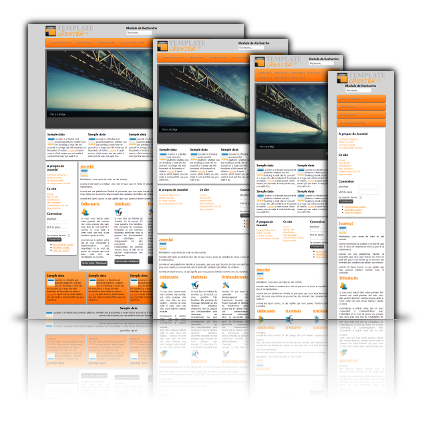
- A Joomla! 2.5 Responsive Design template : the final result that you will get with the tutorial
- A gabarit for Template Creator to adapt the template structure to your needs with Template Creator CK (used to create the template)
And all this is FREE !
Download the Tutorial adapt your Joomla! template for mobiles
Table of content :
I.Introduction 6
II.The blah blah of the theory 7
1.The techniques 8
1.1)User agent - PHP 8
1.2)Javascript 8
1.3)Mediaqueries 8
2.Drivers 9
3.How does it work ? 10
3.1)To fix the resizing of the display on Smartphones 10
3.2)Adding conditions of screen size 10
III.Pratical case - tutorial 11
1.Creation of the base template 12
2.Defining the design according to the resolution 15
2.1)5.1) Design with a 758px width 17
2.2)Design with a 524 px width 17
2.3)Design with a 292px width 18
3.Modification of the index.php file 19
4.Creation of the CSS style sheet 20
4.1)7.1) Tablet in portrait mode: 758px 20
4.2)7.1) Tablet in portrait mode: 524px 24
4.3)Mobile in portrait mode: 292px 30
5.Bonus - Adjusting submenus in Maximenu CK 39
6.Bonus 2 - Detection of User-Agent for the Slideshow 47
7.Used extensions 49
7.1)Template Creator CK 49
7.2)Maximenu CK 49
7.3)Slideshow CK 49
8.Resources 50